
Thursday, April 17, 2014
Accumulative line graph (Lorenz curve)
Parallel coordinate graph

A parallel coordinate plot maps each row in the data table as a line, or profile. Each attribute of a row is represented by a point on the line. This makes parallel coordinate plots similar in appearance to line charts, but the way data is translated into a plot is substantially different. A Parallel coordinate graph represents two or more variables. The above displays information on an x and y axis. The y axis represents greenhouse gas global warming potential from lowest, represented using red lines, and highest, represented using purple lines. The x axis displays 6 different software implementation versions and each are separated by a black line that runs vertical through the graph. I find these types of graphs to be difficult and hard to read.
Climograph

A climograph
is a graphical representation
of basic climatic parameters. That is, monthly average temperature and precipitation,
at a certain location. It is used for a quick-view of the climate of a
location. A climograph is a weather graph used to chart monthly precipitation and temperature conditions for a given location. Above is bar graph for the temperature and precipitation averages for Boulder, CO.
Box Plot

Index value plot
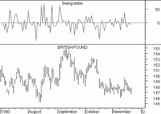
In an index value plot, data is plotted relative to an index. Here we see the change in value of the British Pound over a time period, and above that charge an index value plot where the swing of value is plotted against a 0 index, departures appearing both as positive and negative values.
Similarity Matrix

A similarity matrix shows exactly what its name implies: the similarity between variable along a scale. Similarities are visualized by varying the colors of the boxes. This particular matrix is from a study on gene expression. Data pairs with significant similarity are shown in dark red, while those with no significant similarity are white, the rest are gradients between. Color visualizations like this can allow a cartographer to display complex data in a simple way.
Correlation matrix

A correlation matrix is simply a matrix giving the
correlations, or relationship, between all pairs of data sets. In a
correlation matrix correlations have values on ranging from -1 to
1. This means that 1 represents the greatest correlation, while -1
represents the least. To read the correlation matrix you like up the
row and column you want to compare. The above map is a correlation
matrix comparing lifestyles.
Subscribe to:
Posts (Atom)