
Thursday, April 17, 2014
Accumulative line graph (Lorenz curve)
Parallel coordinate graph

A parallel coordinate plot maps each row in the data table as a line, or profile. Each attribute of a row is represented by a point on the line. This makes parallel coordinate plots similar in appearance to line charts, but the way data is translated into a plot is substantially different. A Parallel coordinate graph represents two or more variables. The above displays information on an x and y axis. The y axis represents greenhouse gas global warming potential from lowest, represented using red lines, and highest, represented using purple lines. The x axis displays 6 different software implementation versions and each are separated by a black line that runs vertical through the graph. I find these types of graphs to be difficult and hard to read.
Climograph

A climograph
is a graphical representation
of basic climatic parameters. That is, monthly average temperature and precipitation,
at a certain location. It is used for a quick-view of the climate of a
location. A climograph is a weather graph used to chart monthly precipitation and temperature conditions for a given location. Above is bar graph for the temperature and precipitation averages for Boulder, CO.
Box Plot

Index value plot
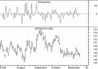
In an index value plot, data is plotted relative to an index. Here we see the change in value of the British Pound over a time period, and above that charge an index value plot where the swing of value is plotted against a 0 index, departures appearing both as positive and negative values.
Similarity Matrix

A similarity matrix shows exactly what its name implies: the similarity between variable along a scale. Similarities are visualized by varying the colors of the boxes. This particular matrix is from a study on gene expression. Data pairs with significant similarity are shown in dark red, while those with no significant similarity are white, the rest are gradients between. Color visualizations like this can allow a cartographer to display complex data in a simple way.
Correlation matrix

A correlation matrix is simply a matrix giving the
correlations, or relationship, between all pairs of data sets. In a
correlation matrix correlations have values on ranging from -1 to
1. This means that 1 represents the greatest correlation, while -1
represents the least. To read the correlation matrix you like up the
row and column you want to compare. The above map is a correlation
matrix comparing lifestyles.
Triangular plot

A triangular (or ternary) plot is sound much more
complicated than it actually is. A triangular plot simply
displays three variables or data sets in the shape of a triangle defined on
horizontal and vertical axes. The triangular plot seen above
illustrates to plot the chemical analysis of igneous rocks.
Bilateral Graph

A bilateral graph is very similar to a bar graph or
a histogram however it is, of course, bilateral. Bilateral graphs compare
two or more sets of data in a visual graph. Sometimes bilateral
graphs have multiple bars side by side and some bilateral graphs have bars that
are opposite one another. This is an example of a bilateral graph. A bilateral graph can show 2 or more different sets of data on the same
graph. This graph shows trade of clean energy products between the
United States and China. The blue bars indicate exports, while the white
bars indicate imports. The red bars show the trade deficit. It is
clear, that the US has been importing far more clean energy products than it
has exported from 2006 to 2010.
Population profile

A population profile is a chart showing the number of people as a function of their ages. Above is a population profile simulating projected population structure with and without the AIDS epidemic, Botswana, year 2020.
Stem and leaf plot

A stem and leaf plot is a type of graph that is similar to a histogram but shows more information. The stem and leaf plot summarizes the shape of a data set (the distribution) and provides extra detail regarding individual values. Above is a steam and leaf plot providing information about the infant mortality rate in Western Africa.
Histogram

A histogram is a graphical display of tabulated frequencies, shown as bars. It shows what proportion of cases fall into each of several categories. A histogram differs from a bar chart in that it is the area of the bar that denotes the value, not the height as in bar charts, a crucial distinction when the categories are not of uniform width. The example above is an example of a histogram shown as a bar graph, showing information about how many students scored certain scores on their final exam.
Windrose

A wind rose is a graphic tool used by meteorologists to give a succinct view of how wind speed and direction are typically distributed at a particular location. Presented in a circular format, the wind rose shows the frequency of winds blowing from particular directions. The length of each "spoke" around the circle is related to the frequency that the wind blows from a particular direction per unit time. Above is an example of a windrose diagram from Seattle, Washington.
Scatterplot

A scatterplot is a summary of bivariate data that consists of individual points plotted on the graph. The points show the relationship between 2 variables, and form a pattern that indicates the strength of the relationship. Scatterplots can be used to plot a trend line and determine the association between the two variables. In this scatterplot, husbands' and wives' ages are plotted, resulting in a positive association and a strong relationship since the points are all pretty close to one another.
Nominal area choropleth maps

A nominal area choropleth map is a thematic map that displays areal data. These maps use different colors or patterns to distinguish between certain areas or regions. The data that is represented is nominal data, meaning there is no ranking order for each category, so therefore a rainbow of different colors is many times used. These maps are useful for comparing measurements or data between different states or regions. In the nominal choropleth map displayed above, different minority groups with the highest percent of the state population are represented by a variety of colors.
Unstandardized Choropleth Maps

An unstandardized choropleth map is a thematic map that displays data sets as raw numbers. Instead of averaging the data, it is represented as its original value. The map above shows the results of the 2010 National Police Misconduct Statistics and Reports Project for the 3rd Quarter. Each color on the map represents a different data value in it's raw form.
Standardized Choropleth Map

Standardized choropleth maps display areally averaged data. This means that instead of just representing a total value, the information is standardized to some unit, usually area. A common example of standardized choropleth maps are those that show the number of people per square mile in a state. The map above shows the percentage of the Canada's population that's14 years and under.
Univariate choropleth map

A univariate choropleth map displays data from only one variable. Though still following satisfying all the criteria to be considered a choropleth map, this type of map is much simpler than other choropleth maps that displays data of multiple variables. In this example, the estimated median household income for 2008 is the only variable analyzed and shown on the map. The scale uses progressively darker shades of one color is used to show an increase, and make it easier for viewers to compare different regions of the U.S.
Bivariate choropleth maps

Bivariate choropleth maps have the same characteristics of the choropleth map but display two separate occurrences at the exact same time. By combining two separate sets of graphic symbols on the same map this can be portrayed successfully. Above is an example of bivariate choropleth maps of a single realization, the chosen estimate and a map of the uncertainties associated with that estimate.
Unclassed choropleth maps

In classed choropleth maps, different colors are chosen to represent different degrees of a category. In unclassed choropleth maps, differing degrees of a value are represented on a continuous color scale that gets darker to represent higher values of the category. The above image shows the fertility rate attribute values for countries in Europe. The maximum fertility rate of 2.27 children per woman (Albania) is represented by the darkest shade of orange, while the lowest rate of 1.13 (Bulgaria) is represented by the lightest shade of orange.
Classed choropleth maps

Choropleth maps present various types of statistical or areal data. A classed choropleth map is a particular type of choropleth map that uses smaller intervals to portray the data. It is broken down into a scale and presented using colored intervals. This particular map have five classification internals. The colors used to display that data are from yellow to dark green. This map is a standardized map as well since it present the data per student. This map depicts the amount in dollars spent per student in the Public Education System in North Carolina. The statistics are for the 1994-1995 school year.
Range graded proportional circle map

Range Graded Proportional Circle Maps use a limited number of circle sizes which represent ranges of numbers. This is less proportionally exact as a continuously variable set of circles would be, but it makes up for it in simplicity. This map of Motor Vehicle Deaths in California uses this method.
Star Plots

A star plot is a method used to determine relative values for a single data point. Star plots have a sequence of spokes. Each spoke represents one variable. The data length of the spoke is proportionate to the magnitude of the variable. Star plots are usually shown with numerous plots in one diagram, to compare and contrast observations. Above is a great example of a star plot with spokes.
Continuously variable proportional circle map

A continuously variable proportional circle map is a variation of the proportional circle map. What makes this type of map different is that multiple variables are or may be represented on the varying size circles. The above image is an example of this as the size of the circle depends on how much meat those regions of France sent to the butchers in Paris. Those circles are then divided similar to a pie chart to represent what type and percentage of meat was sent to the butchers of Paris.
DOQQ (Digital Orthophoto Quarter Quads)

DOQQ's are digital aerial images produced by the USGS. They contain orthorectified aerial photography at a resolution of one meter. The map above is a 1998 color infrared DOQQ, part of flowers NE, Johnston County.
DEM

This is a 3D DEM map of the Sahara Desert, Tunisia. A digital elevation model is a digital model or 3D representation of a terrain's surface, commonly for a planet (including Earth), moon, or asteroid, created from terrain elevation data.
DLG

DLG stands for digital line graph. It is a form of digital map developed by the United States Geological Survey. Above is an example of a DLG map with 1:24,000 scale, SDTS format only.
Wednesday, April 16, 2014
DRG

Isopach

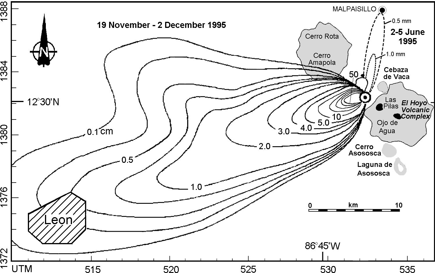
http://www.geo.mtu.edu/volcanoes/central_america/nicaragua/cerro_negro/gvn/images/2012neg4.jpg
An isopach is a line on a map that connects point of equal thickness of a geological stratum formation or group of formations. Above is an Isopach map of ashfall from Cerro Negro from November 19th to December 2, 1995. Isopachs within the 5.0 cm limit are at 10-cm intervals, up to 50 cm closest to the crater.
Isopleths

An isopleth map generalizes and simplifies data with a continuous distribution. It shows the data as a third dimension on a map, thus isopleth maps are more common for mapping surface elevations, amounts of precipitation, atmospheric pressure, and numerous other measurements that can be viewed statistically as a third dimension. Specifically, an isopleth is a line on a map connecting places registering the same amount or ratio of some geographical or meteorological phenomenon. The map above shows isopleths of mold germination and growth rate. As you can see, the wetter a surface the quicker mold spores will germinate and the quicker they will grow. Typical room temperatures of 21 degrees Celsius are about ideal for mold growth.
Subscribe to:
Comments (Atom)